Behind the Scenes: Houndstooth Shrug
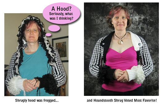
The Houndstooth Shrug won by a landslide in the Twins Face Off Shrug design challenge. But it wasn’t always stunningly beautiful. It went through a couple of redsigns on it’s way to greatness.
“Shrugly” was how Deborah’s husband described the shrug at one point. Yep, combine the word shrug with ugly and you get one shrugly garment.

I think Deborah lost 50 pounds by getting rid of the hood!

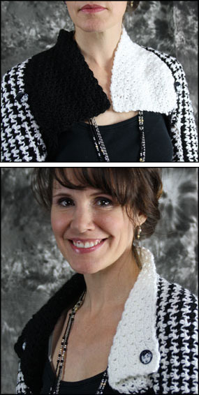
Deborah and I talked on the phone throughout the design process and at one point I encouraged her to google images for Cruella Deville (cartoon character in 101 Dalmations). She liked the idea of splitting black and white on the outfit.
Deborah also mentioned that the collar was a happy accident. “I originally designing the collar so that it would join and buttoned in the center front,” she explaiend. “But, when I folded the collar back it created a stunning lapel”. The back of the collar looks great folded flat (as pictured above) or up (pictured right).
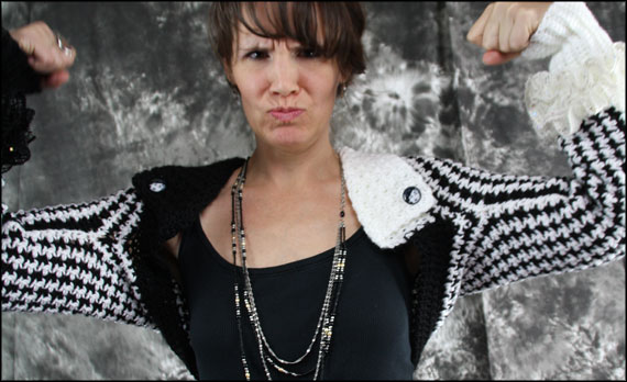
Kudos to Deborah for working and reworking her design until she got it just right. It’s absolutely gorgeous.
She held strong to her convictions to create a beautiful garment and her hard worked paid off.

You can see more pictures of the Houndstooth Shrug in the shop.
Houndstooth Shrug available on Etsy.

